- Expert advice/
- Invites & paper/
- Save the dates/
- 12 Save the Date Design Ideas
- Save the dates
12 Save the Date Design Ideas
Need some Save the Date design ideas to get the imagination flowing? We’re here to help.
Last updated February 5, 2024
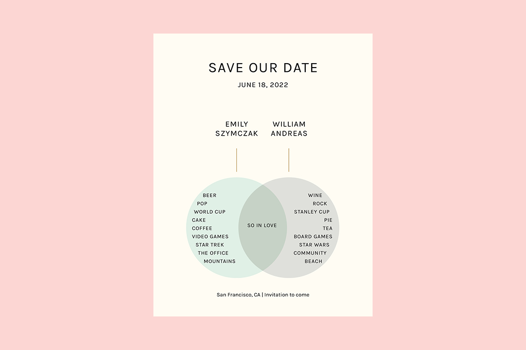
The First Look ✨
- Traditional Save the Dates with simple text on beautiful paper stock, black and white engagement pictures, or hand-written calligraphy will help exude classic sophistication.
- Share the good news with your wedding guests with contemporary designs like a Save the Date that doubles as a magnet, using multiple shades of just one color, or even just choosing bold, playful fonts.
- Use a mix of fun and funky fonts, colorful hues, or get really creative by printing your Save the Dates details on a T-shirt! Look to Zola for a wonderful variety of stylish Save the Dates, wedding invitations, and more!
Save the Date is an essential part of your wedding stationery suite. It helps ensure the people you love to know when it’s time to celebrate you and your partner’s love and is the first impression of your overall wedding theme.
No pressure, right?
When it comes to designing the perfect Save the Date to set the stage for your big day and help your guests mark their calendars, Zola has everything you need with this guide to Save the Date design ideas.
This guide will start with an overview of basic design elements to consider as you craft your perfect Save the Date, then take a close look at four categories of Save the Date design ideas:
- Traditional Save the Date Ideas: Ideas that stand the test of time
- Contemporary Save the Dates: Design ideas for a more lively, modern twist
- Eccentric Save the Date Ideas: For the most innovative couples saying “I do”
- Personalized Save the Date Ideas: Designs that offer a personal touch
In each section, we’ll define the idea’s characteristics, then provide three sample concepts to get your creative gears turning. But first: What are Save the Dates, and why do they matter?
Save the Date 101: What It Is and What It Does
A Save the Date card is a card or email sent to all potential guests of your wedding that tells them what date the wedding will be and its location.
It’s not an invitation proper, but a precursor that helps potential guests prepare their schedule for the upcoming wedding. And, unlike the formal invitation to your wedding, a Save the Date isn’t a requirement, just a best practice. If you do choose to send these announcements to potential guests, be sure to read up on proper Save the Date etiquette.
Save the Dates give your potential invites and guests a bit more wiggle room to make sure they can attend the wedding. They’re also a delightful, low-stakes reminder of your celebration. Additionally, you can find out right away if your date won’t work for certain guests, so you can extend invitations to friends and family who didn’t quite make it to your “varsity” guest list.
If nothing else, they’re an extra chance to celebrate.
Basic Save the Date Design Elements
Your Save the Date card should include a couple of key elements, no matter what design you choose. Namely, it needs to include the following information:
-
The exact date, or approximate date range (a weekend), that guests should keep open for your upcoming wedding.
-
The exact venue, or at least a city or region, so that guests can plan for any travel ahead of time. This is especially important if you’re planning a destination wedding or if you’re inviting guests out of state or country.
-
The name of the couple saying “I do” (that’s you and your partner!) and updated contact information.
Beyond these baseline elements, it’s up to you to decide what else you want to include. Some couples may decide to mix up their Save the Dates according to their needs. For example, many couples add a link to a wedding website or registry to give guests plenty of time to start contributing to the honeymoon fund or cookware collection.
Design gorgeous Save the Dates with matching wedding websites with a little help from Zola. Explore hundreds of Save the Dates templates you can customize with premium paper types as well as foil accents. Each Save the Date design is also available in our free wedding website templates, so you can create a cohesive design from the very start of your wedding journey.
The Main Elements of a Save the Date Design
The actual text content of your Save the Date is just the start of the design process—you’ll also want to think about the following key aesthetic elements when designing your cards to ensure your personalities and wedding theme are beautifully represented:
-
Material: You could opt for standard cardstock or choose a fancier antique paper, a magnet or sticker (because most Save the Dates wind up on a guest’s refrigerator door as a fun reminder), or even a cloth-like paper type like Linen.
-
Imagery: The color scheme and pictures you use can also vary, from an adorable photograph of the two of you to geometrical patterns, in your wedding colors.
-
Text: Besides the words that appear on your cards, you’ll also want to carefully select elements like font, size, color, and placement—whether printed or handwritten.
Traditional Save the Date Ideas
Couples who have a taste for classical or more time-tested aesthetics may opt for a Save the Date design with a more formal look because simple elegance never goes out of style.
One of the ways you can infuse classic style into your Save the Date is through the wording of the card. A more traditional Save the Date will likely use expressions like:
-
The words “Save the Date,” rather than a casual language like “we’re saying I do!”
-
The full names of the partners to be married, often separated by “and” on its line
-
A “formal invitation to follow” rather than something like “watch out for our invite”
These more formal approaches may prioritize simplicity or legibility over other design elements, and that’s fine. After all, a Save the Date has a job to do—help your guests save the date—and the more clearly you can portray that information the better. The beauty of a text-only design has one important benefit: it lessens the long list of decisions you have to make for your big day.
Of course, you can include more subdued images and colors. Do what feels in line with your wedding vision, and don’t forget to savor the moment—you’ve got a date and you can finally tell everyone.
1. Simple Text on Beautiful Paper
Sometimes a few simple words about your upcoming wedding stand out best on gorgeous paper stock. At Zola, we offer a variety of premium paper types to give your classic wedding invitation a luxurious feel including:
-
Smooth – This cardstock offers the sleek surface of a lightweight business card with an elegant sheen.
-
Eggshell – Soft, thin cardstock that makes watercolor and painterly designs come to life
-
Recycled – Ideal for the sustainability-minded couple, this paper type has a postcard thickness with a soft, smooth surface.
-
Pearlescent – The glossy finish on this slightly thick paper type adds a hint of glamor to any Save the Date.
-
Linen – This paper type mimics the texture of linen to give your Save the Date a vintage or classic feel.
-
Natural – One of our more textured paper types, this stock has the feel of a sturdy postcard but with a rugged and almost leather-like surface
-
Double Thick or Triple Thick – For Save the Dates with a bit of weight, try our Double Thick or Triple Thick paper types. The Double Thick is about twice the thickness of a credit card, giving it a heft and durability you’ll love. Triple Thick feels more like a hard notebook cover so your Save the Date can look extra luxurious and last well after the honeymoon.
By choosing a paper material that makes a statement, you can keep your Save the Dates elegant and timeless.
2. A Black and White Photograph
One of the most tried and true approaches to the Save the Date design is featuring a picture of the couple prominently on the card. One way to dress up this relatively common technique and make your Save the Date stand out is to use a black and white photograph of you and your personality.
Couples can take this design to the next level by customizing their photo beyond just the color— effects used while taking the photo or editing it can enhance the old-timey feel. For example, decreasing its contrast and increasing brightness can create a “blown out” look common in older photographs. This can be done by a professional photographer, or with some fun photo apps.
3. Handwritten Calligraphy
Want your Save the Date to feel like it was torn out of an elegant old-fashioned storybook? Try calligraphy. While computer-generated fonts have come a long way and make for ideal readability, hand-drawn lettering is a show-stopper—especially if you or your partner have a talent for calligraphy, or can contract a professional (or friend) who does.
Giving a hand-drawn element to your Save the Date is maybe the most traditional move of all, harkening back to the days before cars were mass-produced and delivered through technology. It’s sure to make your wedding guests feel like they’re stepping into a fairy tale love story.
If your calligraphy hand is a little rusty, you can explore Zola’s collection of Elegant & Classic Save the Date cards. Calligraphy-style fonts will give your Save the Dates a regal feel (without having to worry about dripping ink on your clothes from your calligraphy brush).
Contemporary Save the Dates for the Cool Cat Couples
For couples who want a more modern, contemporary feel for their overall wedding design, an updated take on the traditional Save the Date may be the perfect fit. And, just like with the traditional designs, the modern touch can be felt in the language that appears on the stationery card, with text like:
-
A more casual introductory line, such as “Lookout, world!” or “Guess what? We’re getting married!”
-
Use of first names only, or nicknames, for the partners to be wed
-
Funny or quirky instructions, like “You’d better be ready,” rather than more formal language
Modern Save the Dates are also more likely to make bold design decisions, prioritizing elements like aesthetics over legibility. Or, they might forego ornate elements and embrace minimalism.
4. An Eye-Catching Magnet
If you’re open to rethinking the traditional conventions of the Save the Date card, why not get rid of the idea that it has to be a stationery card in the first place? One great way to help your potential guests remember to save your data is to make your card into an object they can use to decorate their home. Consider a magnet or sticker in addition to a card or as the “card” itself.
Many recipients of Save the Dates will be sticking them on their refrigerator or corkboard anyway. So incorporating that functionality right into your design saves them an extra step. If you love the modern touch of this attractive option, you can choose from hundreds of magnetic Save the Date designs at Zola. Customize your Save the Date with additional modern details like colorful foil accents or upload your design! You’ll find all the possibilities at Zola.
5. Elegant, Sleek Monochrome
One way to emphasize the sleek modernity of your Save the Date is by embracing a more monochrome look. For example, you might use a selection of gray hues for all elements of the card—a grayscale photo framed in a darker or lighter gray with white or black lettering. It’s a little bit edgy, very modern, and undeniably cool.
Monochrome works especially well with designs that incorporate geometric shapes or patterns rather than photographs. It also works well with text-only options.
6. Bold Minimalism, Text-Only
One last modern design concept for a Save the Date is a more contemporary spin on the text-only option. Couples might opt for a blank or subtle background, complemented by the relatively small text in a no-frills font. This minimalist approach creates a subdued, sleek, modern look—think of Apple designs and packaging—perfect for tech-obsessed couples.
Eccentric Save the Date Ideas
Eccentric designs are not necessarily characterized by the text that appears on the card, but rather the bold, unique choices that set them apart from anything guests have seen before. Consider:
-
Printing on materials that guests would never imagine to associate with a Save the Date
-
Using a wide variety of colors, including unexpected pairings
-
Putting multiple fonts nearby, creating a dynamic reader experience
These designs are not for the faint of heart, but with a little creativity (and a lot of fun), you’ll find the right design for you.
7. T-Shirts to Remember
Similar to the modern concept of a magnet or sticker above, this more eccentric concept takes things one step further into the wearable design. Rather than sending a relatively simple card to all your potential guests, why not send them a T-shirt they can wear in anticipation of your big day?
Printing on a usable textile doesn’t need to stop at T-shirts; you might decide to send a tote bag or other garment, instead. Foregoing the need for a paper card, the possibilities are endless. Plus, instead of recycling the Save the Date when the day has passed, your guests can put their Save the Dates to use and remember your big day fondly whenever they pull on the shirt or head to the grocery store with their reusable tote.
8. Bright, Splashy Colors
No matter what kind of material you print on, a surefire way to wow your potential invitees is using big, bold color combinations.
For example, using bright neon colors could be perfect for an 80s-themed celebration. Or, a bright assortment of jewel tones can lend an eye-catching luxury to your invites. These elements can apply to photographs, too. You can use color uniquely in an eccentric concept with a photo mosaic or other collage-like design. A QR code hidden on the back of the card can link to all the full-sized images used.
9. An Eclectic Mix of Fonts
Materials and colors or images aren’t the only way to flex your creativity. Couples may also choose to emphasize the text on their Save the Dates with multiple font styles and sizes. This can create an effect similar to a photo collage, and it works especially well with a more subtle background.
For example, you might use a different font for each line, so that “Save the Date” looks different from you and your partner’s names. Or you might choose to use a different font for each name, such as a script-like elegant font for the more traditional partner, and Helvetica for the one with more modern tastes. This is a great way to bridge the gap between classic and contemporary.
Personalized Save the Date Ideas
Finally, the last category of design ideas for your Save the Dates encompasses everything unique about you and your partner’s relationship, as well as your connections to those you are inviting. Like eccentric designs, these are classified less by the text than by your touches:
-
References to meaningful experiences you’ve shared with your partner (or guests)
-
Hints at the broader themes and/or design language for the wedding itself
-
Customized loving messages for each recipient, from one or both partners
This is the most unique category of all, as it includes details and specifications that would be different for any couple trying any of the concepts above. Let’s take a look at how to nail them.
10. Postcard-Style
A hybrid personalized/eccentric material consideration is opting for a postcard or travel photo to use as the actual card itself, or as an inspiration for the card. If you’re planning a destination wedding, this can be a great way to drum up excitement about travel and give your guests a taste of what the location will be like. When designing these destination weddings Save the Dates, text can appear on the front of the postcard, with the photo, or the back.
Postcards or photos can also refer to special places in your life, such as where you met, or even special places in the lives of the recipients—consider using unique ones for each person invited. This approach pairs well with a personalized message.
Short on postcards? Don’t worry. Zola’s selection of Save the Dates has a postcard option. So no matter what design you choose, your Save the Date will have all the vibes of a romantic getaway.
11. Hint at Wedding Colors
If you’re in love with your unique wedding palette, your Save the Date is the perfect place to start showing it off. Colors can be present in the text, the card material, and in little design details for a colorful Save the Date that sets the scene for your big day.
Of course, the wedding colors don’t have to be the only colors on the card—they can stand out as accents on an otherwise neutral Save the Date, or they can blend in with seasonal colors.
12. Write Guest-Specific Text
Instead of using the same template text on each Save the Date, you could write in a short message, such as a memory or inside joke, to emphasize to your friends and family members how important they are to you—and how important it is that they Save the Date and attend.
This might work best for small weddings because it will immediately create a sense of intimacy and closeness. But if you want to send notes to everyone at your 100-person wedding, we advise recruiting some helpers from your wedding party.
Perfect Your Save the Date with Zola
No matter what design ideas you and your person are considering for your Save the Date, Zola can help you choose or create the perfect cards for your celebration. Our suite of wedding paper services includes everything from Save the Dates and formal invitations/RSVPs to escort cards for the day of and thank-you cards to send out afterward. Whatever you need, we have you covered.
Up next for you
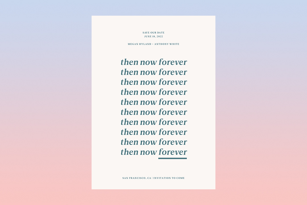
Vow Renewal Save the Date Etiquette
How-To
You're saying "I do"—again! When renewing your vows, what's the deal with the vow renewal Save the Date? Zola, your wedding expert, has the answers!
How to Choose The Best Wedding Month
Getting Started
Choosing your wedding month and date is a crucial first step in the wedding planning process. Here's how to decide on the best time of the year to get married.
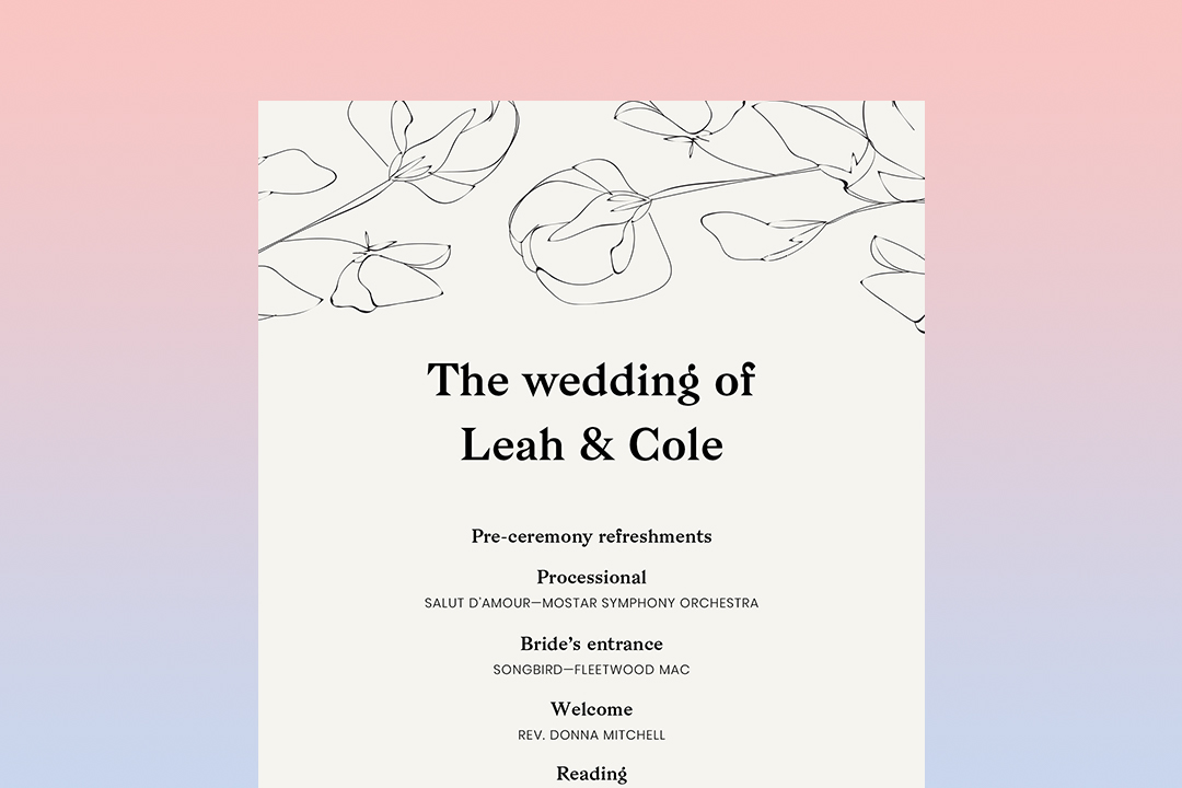
A Guide to Wedding Ceremony Programs
Inspiration
Wedding ceremony programs communicate valuable information to your guests about your ceremony service—find out all you need to know to choose, word, and personalize your wedding programs.
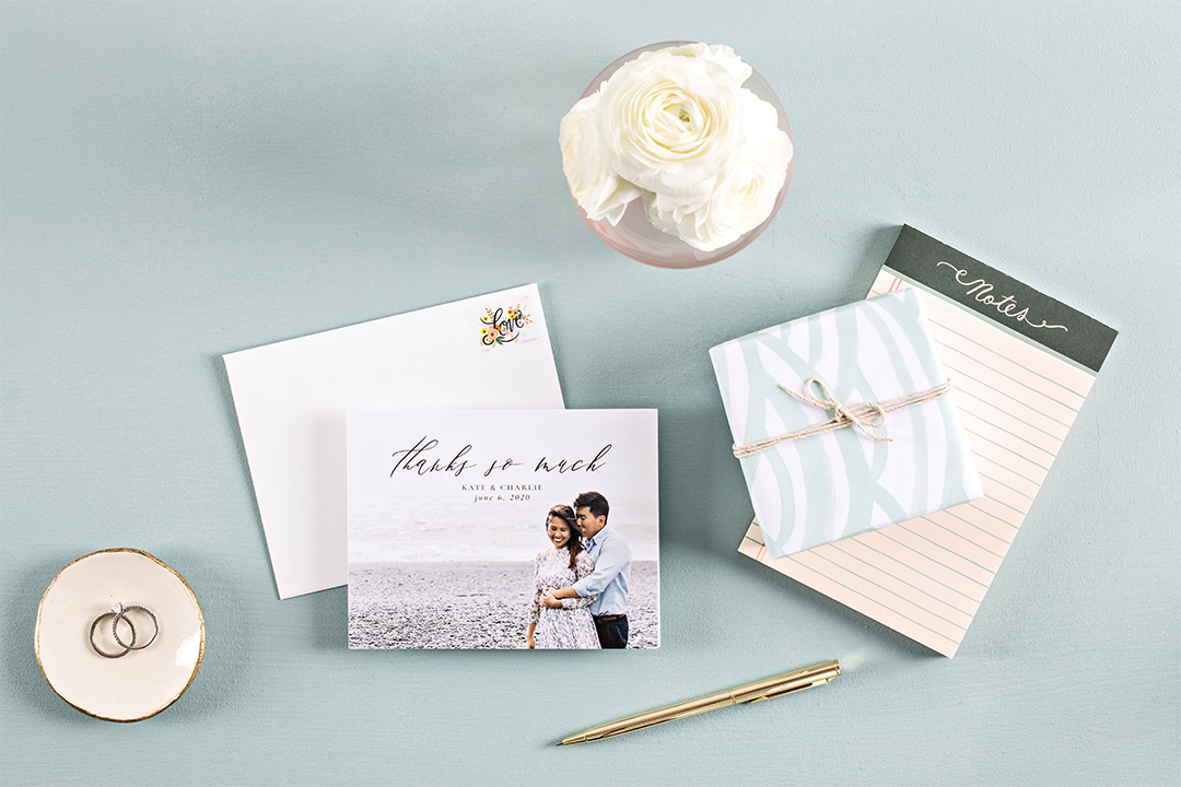
Wedding Thank You Cards–When To Send Them, What To Write, And More
Advice
Do you know when to send wedding thank you cards? We’ll break down this—and more—in our wedding thank you card guide.
Featured
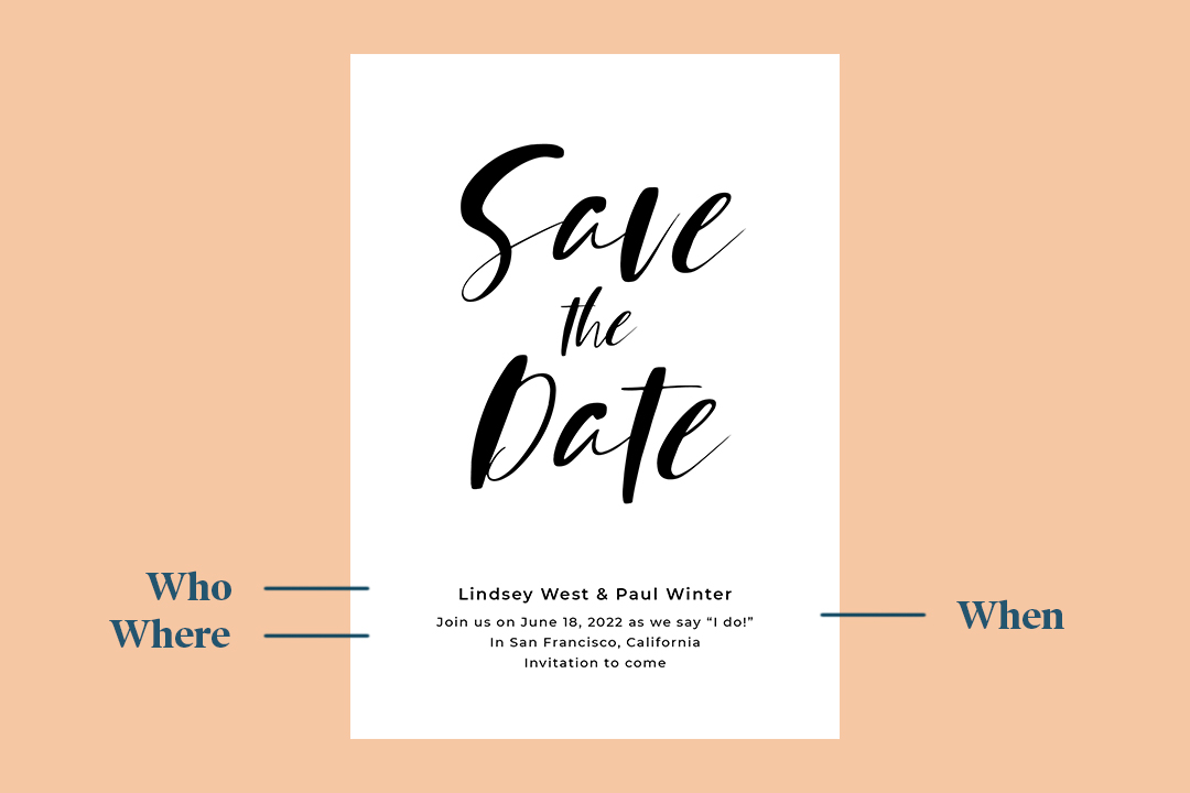
A Guide to Save The Dates
Inspiration
Save the dates add an extra touch of style and coordination to your wedding. Find out why and when you should send your save the dates with this complete guide.
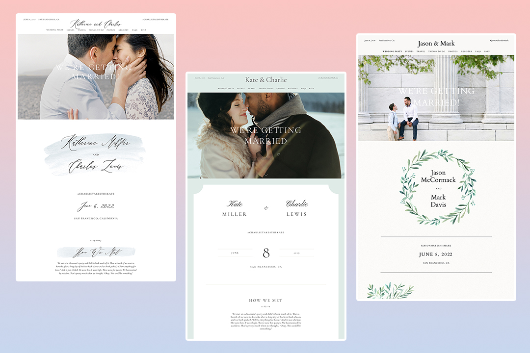
20 Free Wedding Website Templates That Will Inspire You
List
We count down our 20 most popular wedding website templates.
Should We Send a Wedding Invitation to Someone We Know Can’t Come?
Advice
If you know a guest can't come to your wedding, you probably think you don't have to send an invite. Think again. Here's when to send an invite to someone who can't attend the wedding—and when not to.

How to Talk to Friends Who Weren't Invited to Your Wedding
How To
You can't invite everyone to your wedding—for a number of reasons. Read on to learn how to talk to friends who aren't invited to your wedding, tactfully.
- Expert advice/
- Invites & paper/
- Save the dates/
- 12 Save the Date Design Ideas
Find even more wedding ideas, inspo, tips, and tricks
We’ve got wedding planning advice on everything from save the dates to wedding cakes.
